For my Silverlight Line-Of-Business framework I wanted a wait indicator much like there is in Firefox or when starting a Youtube video, which could indicate when the application is going off to the server to retrieve some data (or sending some back). If you don’t know it, the style I’m talking about is eight dots in a circle that light up one after the other around the circle (see the screenshot below). Funnily enough I couldn’t find any controls out there for this purpose, so initially I just used a text block to notify the user something was happening. Now that I have a little more time I decided to revisit this and develop my own. In fact I ended up developing three (that look identical but are implemented differently) in order to familiarise myself with animation in Silverlight, and compare the different approaches.
A bit of an overview of Silverlight animation first (as it pertains to this control with changing the colours of framework elements). A storyboard is added to to the resources of the user control, and defines the animation per element (ie. each object to be animated – in this case each dot in the circle). For each element you specify a number of key frames, which essentially consist of a time and the colour the fill of the element should have at that time. In this case I am changing the alpha value of the fill colour to a specific value and specifying these values in 0.15 second intervals. In between these 0.15 second intervals the Silverlight rendering engine continues to render the animation, interpolating the value of the previous key frame with that of the next key frame to gradually blend the previous key frame’s colour with that of the next key frame.
I first looked at implementing the animation directly in the XAML using a storyboard with a number of key frames. I found this approach quite tedious (especially when I ran it and discovered it was animating in reverse – I had to rearrange 64 key frames manually to fix it). It also blew out the size of my XAML file. When I started building this control I wrapped the storyboard in an Event Trigger (when the canvas loaded) so that it would automatically start when the control was displayed. One concern I had was whether the control would continue to animate even when it wasn’t visible (I’m not sure of the answer to this question as yet), and another was raised when in my research I came across this topic in the MSDN documentation that noted (in the remarks) that this approach was discouraged, and to instead put the storyboard in the UserControl.Resources section instead (and manually trigger the start of the animation):
http://msdn.microsoft.com/en-us/library/system.windows.eventtrigger(VS.95).aspx
So now I trigger the animation by including public methods on the control to start and stop the animation.
Note that each dot in the circle is actually white, but we are just adjusting the alpha levels of each dot (blending in with whatever is behind) to give the impression of a moving dot with a trail. By only altering the alpha value, this means is that you don’t have to use this control on a black background – any backdrop (including graphics) will work and look good.
Now to compare the three approaches. The animation defined in XAML was painful to implement (it may be easier to do in Expression Blend but I was developing the XAML directly in the Visual Studio editor), whilst it was quite easy programatically (both methods). Defining the storyboard in both the XAML page and code of course gave exactly the same look and speed as each other. However manually handling the updating of each “frame” in code produces a slightly slower result (see the sample application to compare) which I found intriguing, despite the same key frame rate – it would be interesting to monitor this difference on a more intensive animation. Of course I could increase the key frame rate (which is the duration of the animation in this implementation, so essentially reducing the duration) to match but I’m not particularly concerned in this scenario. The other difference between the storyboard implementation and the programmatic animation is that they actually look different (as you may note from the screenshot below):
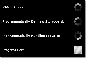
Notice when we are programmatically handling the updates that the “lead dot” is the brightest, whilst when the animation is handled by a storyboard the brightest dot isn’t the “lead dot”, but the second dot in the “bright dots” instead (if that makes sense). This goes back to how the Silverlight rendering engine interpolates the values of the previous and the next key frame – this dot is supposed to be the dullest dot but it knows it is to be the brightest dot at the point of the next key frame so it’s “gearing up for it” by getting brighter as the next key frame approaches. However in our programmatic updates we are changing the values “discretely” once every 0.15 seconds with no interpolation, thus the lead dot is always the brightest.
Another interesting aspect to compare was the size difference in the class libraries for each implementation. As compiled DLLs, the XAML version came in at 14,848 bytes, defining the storyboard programmatically came in at 9,216 bytes, whilst the programmatic animation version came in at just 7,680 bytes. My assumption here is that (and from inspecting each DLL in Reflector) that the XAML file is not compressed when added as a resource to the DLL, while the code in the programmatic version is “compiled” into a relatively compact intermediate language (MSIL) with the comments removed. Of course this is not the whole story with Silverlight as the DLLs are packed into the .xap file in the main Silverlight project (which is compressed in the zip format). So to compare this I zipped each DLL and compared the size of each zip file. The result here was much closer – 3,185 bytes for the XAML version and 2,962 bytes for the programmatic animation – a difference of just 223 bytes, but programmatically defining the storyboard was the largest at 3,863 bytes. So for this example at least you could say that the impact of each version on your XAML file is negligible.
I would welcome feedback on what approach you think is best and could be considered a “best practise” for implementing animation in Silverlight. Whereas it was tedious to define the animation in XAML, it’s likely to be more easily modified in Expression Blend later, whilst the programmatic versions will have to always be altered via code. You have 3 different versions of the control so you can choose your favourite, but until feedback tells me otherwise I will incorporate the version where the animation is defined in the XAML page in my LOB framework.
To use the control in your own projects (whichever version you choose) you could leave it in it’s own DLL (as it is currently) and just reference it from your project, or alternatively just include the .xaml and .cs files in your project. I recommend changing the namespace (you’ll need to do this in both the .xaml file and the .cs file) as the current namespace name is really designed just for the sample application where the three different versions were running along side each other. Then reference the namespace in the user control you want it to appear in with a prefix, and then reference and position the control in your xaml layout (remember to include a name for the control using the x:name attribute). Then in your code behind you can call the Start() and Stop() methods on the control to start and stop the animation. When the animation is stopped the circle of dots will be hidden, only appearing when the animation is running.
Note that there appears to be a bug in the RC0 version of Silverlight – when you use this control on a surface you won’t see a preview of it in the Visual Studio designer as I collapse the canvas until the animation has been started unless it is being hosted in the designer, using the following code:
System.ComponentModel.DesignerProperties.GetIsInDesignMode(this)
which doesn’t appear to pick up the fact that it is in design mode in the Visual Studio designer, so the canvas is collapsed anyway.
As a footnote, after writing the control I was browsing some Silverlight articles about the RC0 release and realised that the new progress bar control could potentially be used as a wait indicator animation also. This control has a property called IsIndeterminate which if set to True does not render a standard progress bar but displays a moving gradient animation, so I have included this in the sample application for completeness. I think my wait indicator control looks a whole lot better though (no doubt I’m biased however).
I hope you find this control useful!
Download
 Chris Anderson